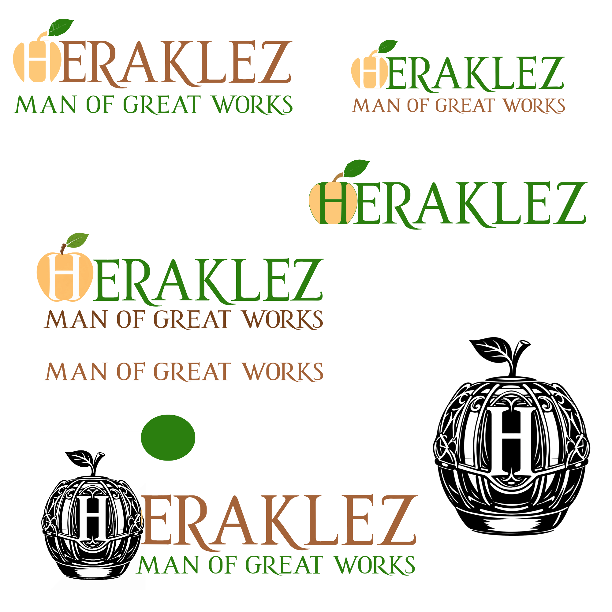

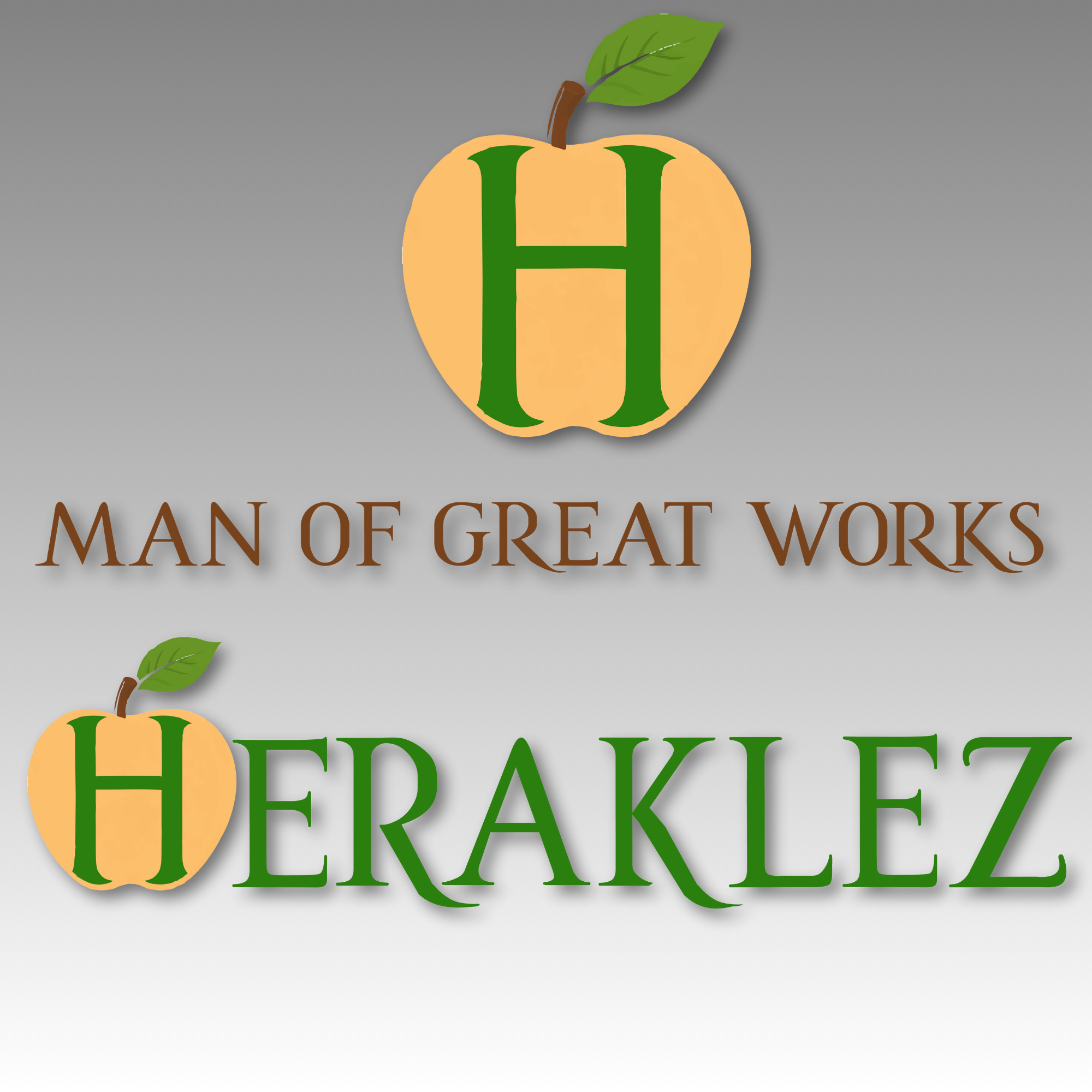
Inspired by Heracles, the Heraklez Logo represents strength, courage, and the perseverance required to overcome immense obstacles.
The apple references the 12th Labor, symbolizing hard work as a foundational value not just in myth, but in life.
The Goal
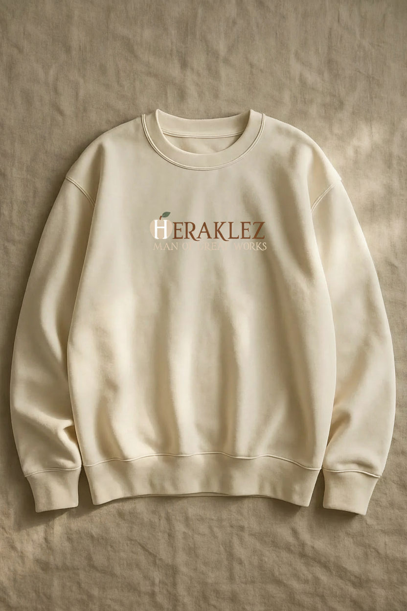
To create a bold, flexible identity inspired by Heracles that represents strength, perseverance, and the work required to overcome immense obstacles, designed to scale across apparel and future brand applications.
The Challenge
The client entered the project with many ideas and references, but no single defined direction. The challenge was to synthesize these concepts into a clear, cohesive visual identity that honored the inspiration while maintaining focus, clarity, and longevity. This process reinforced the importance of design as a problem-solving tool, not just a visual one.
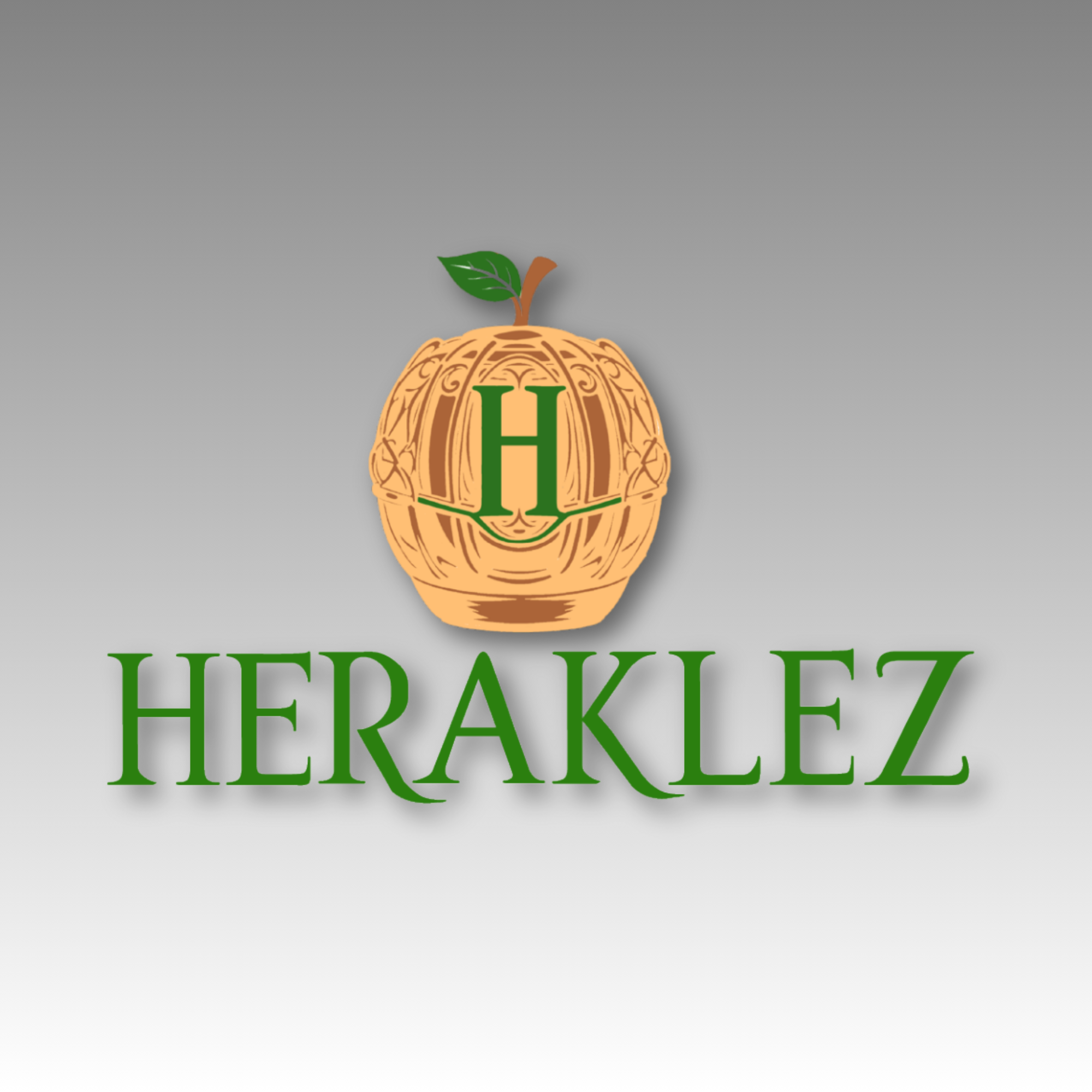
This alternate direction explored a more ornamental, illustrative approach. While visually strong, it ultimately gave way to a more refined system that better supported scalability and long-term use. I did really like this version as well.
Design Approach
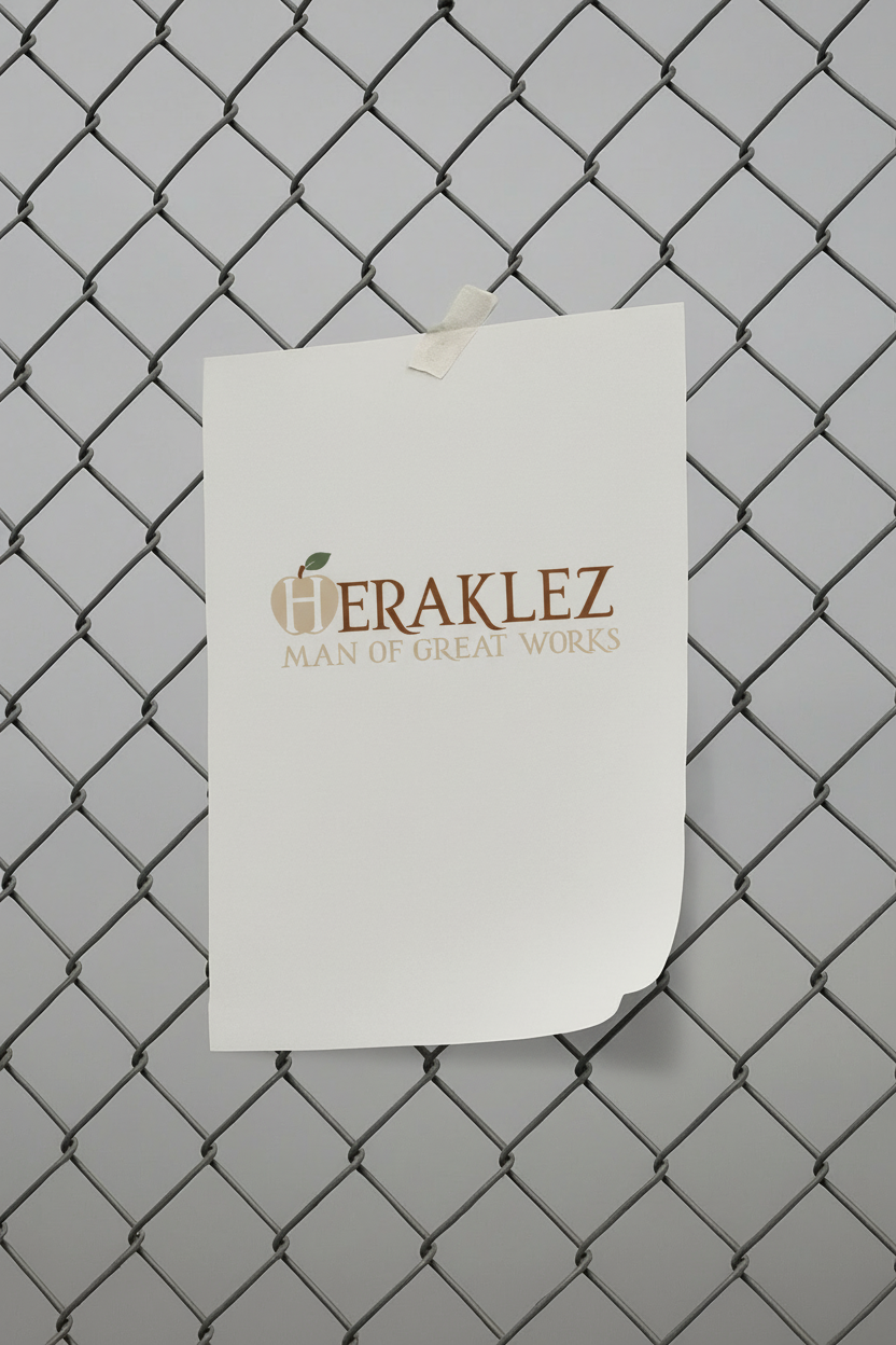
Heraklez was designed as a cohesive system. The typography was custom-refined to enhance uniqueness. Elongating key letterforms such as the R and K to ensure consistency and character across all applications. Every element was crafted to work independently or together, maintaining a unified brand presence at all times.
Visual Exploration
Exploration played a critical role in shaping the Heraklez identity. Multiple visual directions were tested to understand how strength, discipline, and perseverance could be expressed through form, typography, and symbolism.
These explorations informed the final system, helping refine what felt essential, what could be simplified, and what best supported long term scalability.