Nature Speakz Bay Area is a new neuroaffirming nonprofit providing inclusive, nature-based recreational programs led by two best friends, a speech-language pathologist and an occupational therapist. Their work is centered around autonomy, confidence, neurodiversity, and meaningful community participation.
The Goal
To design something that reflects the way Nature Speakz supports communication, sensory regulation, and connection through nature.
Design Approach
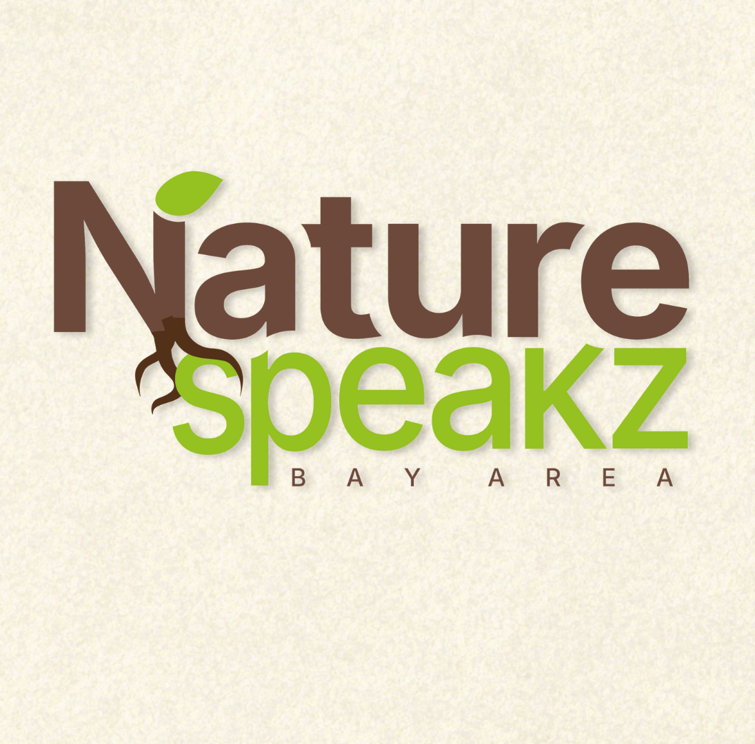
The focus was grounding communication in nature. A rooted “N” serves as the foundation of the wordmark, symbolizing growth, connection, and support. The contrasting, but common colors and minimal structure allows the logo to feel calm, approachable, and expressive, reflecting Nature Speakz Bay Area’s neuroaffirming, nature-based mission.
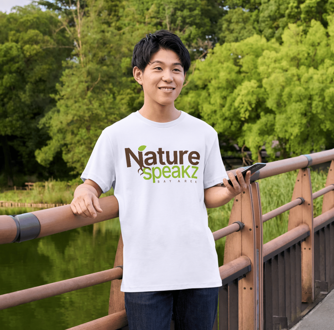
Brand In Context
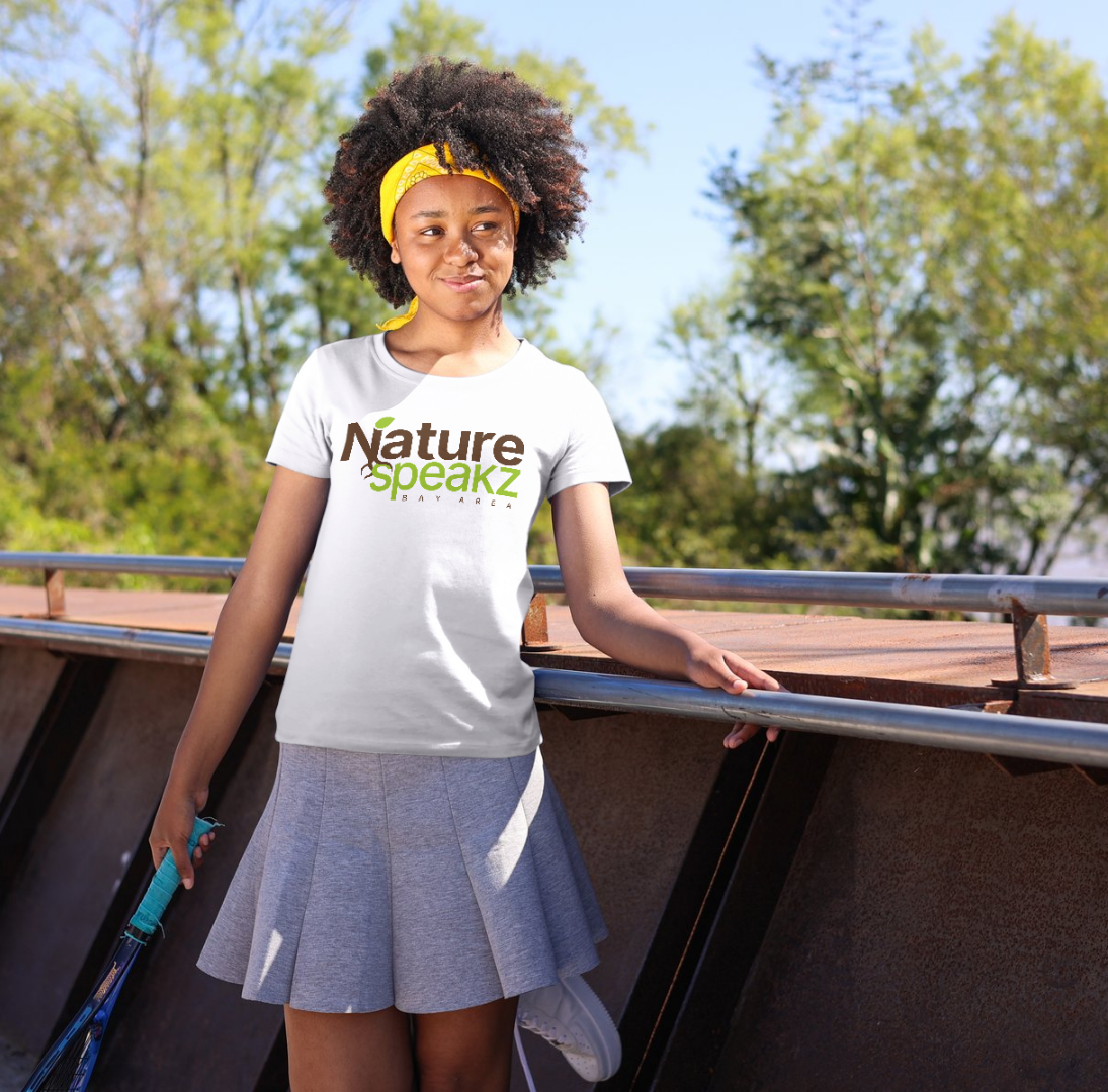
This phase focused (and continues to focus) on bringing the identity into real world use. I photographed the founders in a natural setting to reflect the program environment, then applied the Nature Speakz Bay Area mark to demonstrate the brands feel in action. The goal was to show the identity in context, reinforcing the aesthetic and authenticity through subtle application rather than overt branding.
A small, but meaningful win… Since the founders shared these graphics people have already inquired about purchasing merch, which signals that the work resonates beyond concepts.
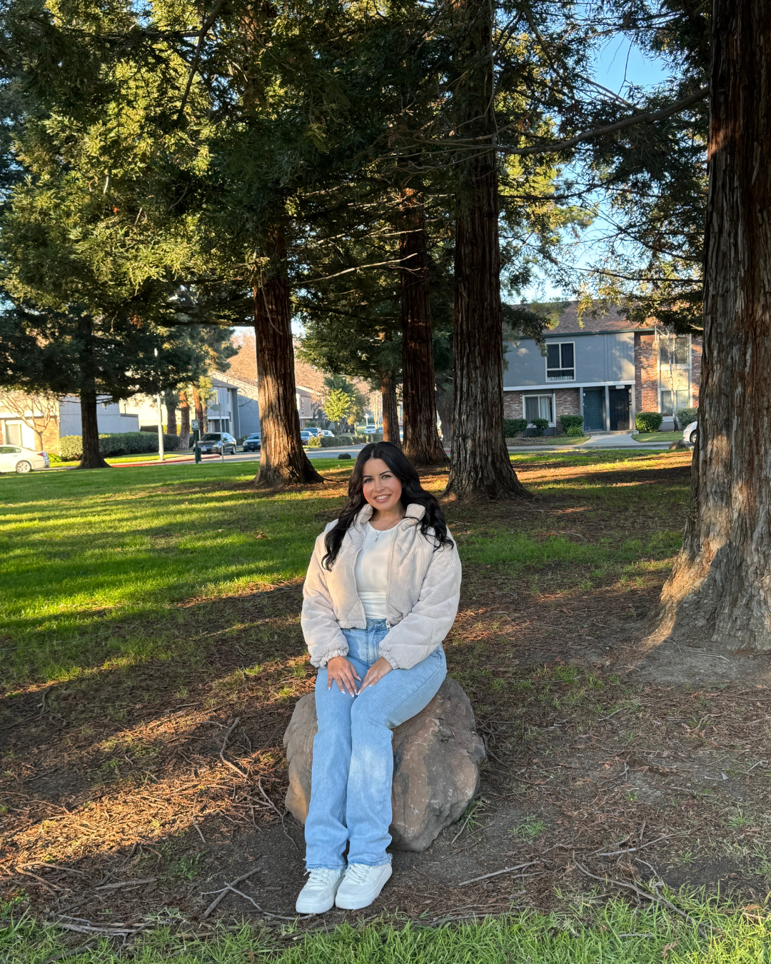
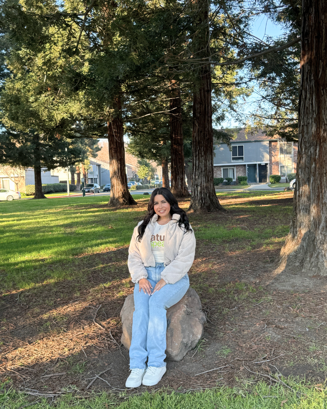
Before and After added branding for Founder Bio
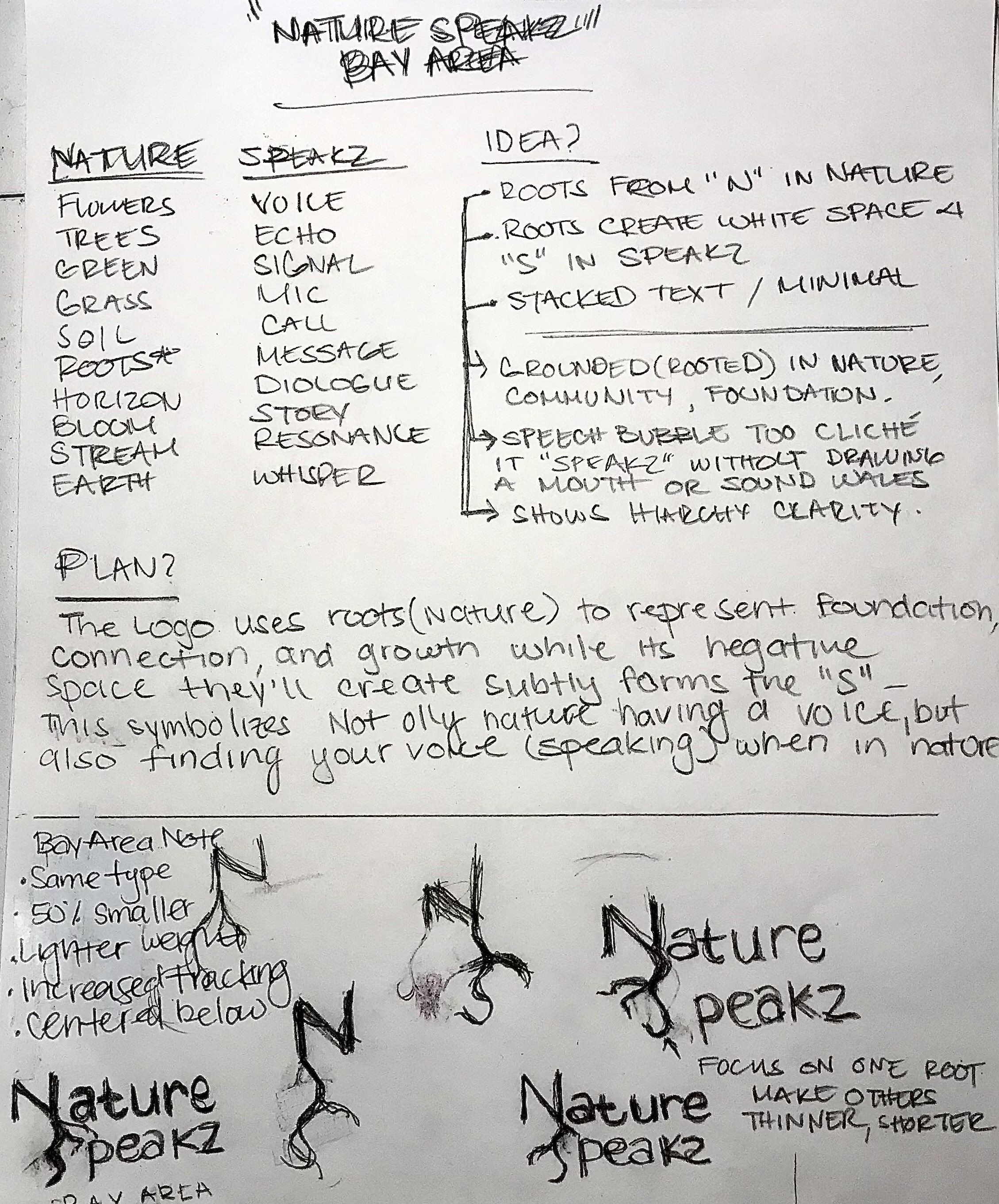
Visual Exploration
Visual exploration focused on merging nature and communication through typography rather than literal symbols. Early sketches tested rooted forms, hierarchy, and negative space to represent foundation, growth, and voice. By exploring restraint and clarity, the direction evolved into a grounded wordmark that communicates connection through nature in a subtle, approachable way.