Root & Rise Consulting is a mission-driven practice supporting organizations, leaders, and community-based systems in building equitable, sustainable, and human-centered structures. The goal of this project was to create a brand identity that felt grounded, resilient, and forward-moving.
The Goal
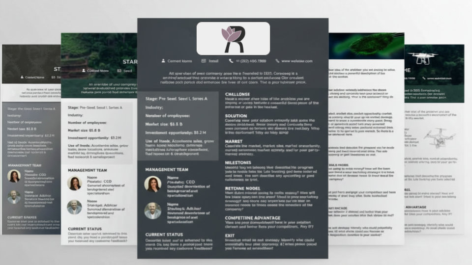
The goal of this rebrand was to evolve Root & Rise Consulting from an initial, symbolic identity into a refined brand system that better reflects the depth of its work. While the original tree mark communicated growth, it lacked the clarity, structure, and distinctiveness needed for a consulting practice operating in complex, compliance-driven environments.
The objective was to create an identity that feels grounded, professional, and human. Oone that could support leadership, systems-level work, and long-term organizational growth.
The Challenge
The primary challenge was moving beyond a familiar, generic tree symbol without losing the core meaning behind it. Root & Rise needed an identity that still spoke to growth and resilience, but with greater intention, authority, and originality.
Visually, the brand had to balance:
Warmth and care with professionalism
Organic symbolism with structural clarity
Emotional resonance with operational credibility
All while remaining adaptable across print, digital, and motion.
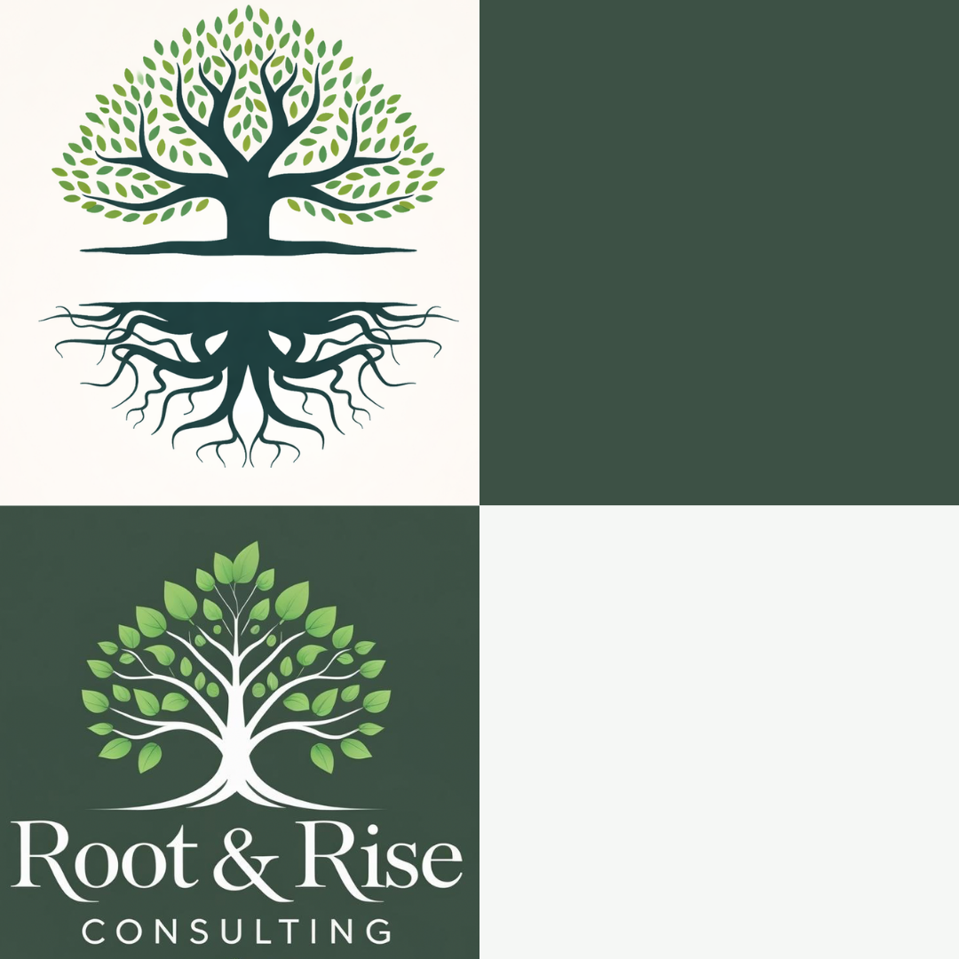
Previous Logo 1
Previous Logo 2
Design Approach
The rebrand focused on distilling the original symbolism into a more intentional mark, one that can be owned.
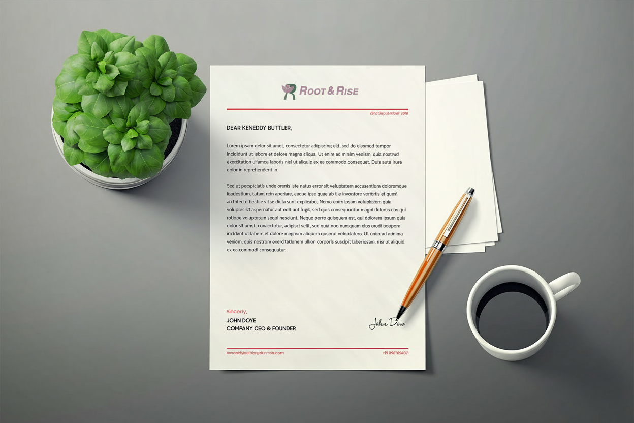
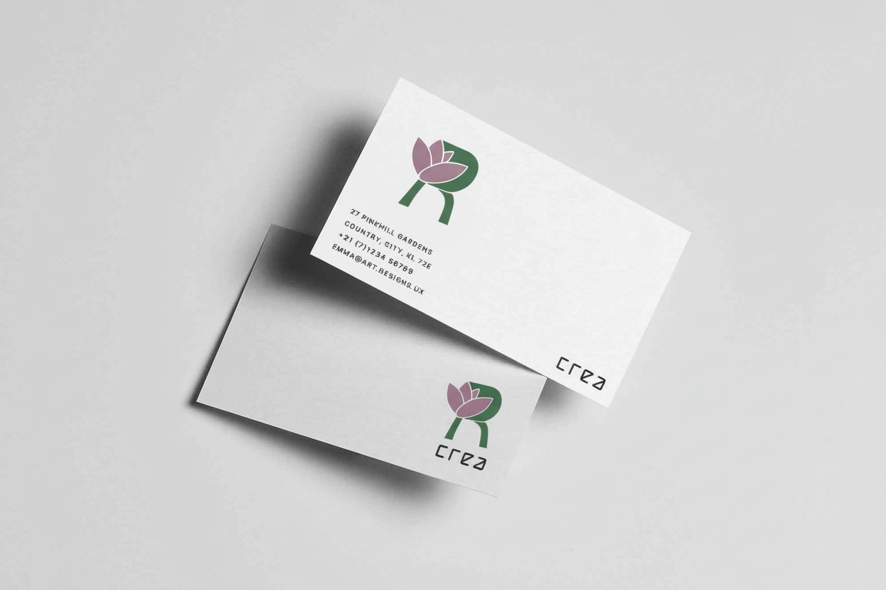
Instead of relying on a literal tree, growth was abstracted into a custom “R” mark, integrating organic forms inspired by a lotus with stable geometry to represent transformation, resilience, and balance. This approach allowed the identity to feel rooted without being illustrative, and distinctive without being decorative.
Earthy greens and muted floral tones reinforce trust and longevity, while clean, modern typography ensures clarity and professionalism.